Maps, Graphs & Charts
 The skills needed to interpret Maps, Graphs, and Charts are very similar, they all involve visual literacy. When looking at these resources to interpret their meanings, here are a few fast tips to remember. The skills needed to interpret Maps, Graphs, and Charts are very similar, they all involve visual literacy. When looking at these resources to interpret their meanings, here are a few fast tips to remember.
-
Don't get distracted! There are often multiple colors and various factors to focus on. Try to break the image down into smaller parts rather than interpreting everything at once.
*Note:While you are focusing on one area, gather as much evidence and meaning from it before moving on to the next item
-
-
To find the overall meaning of the map, graph or chart, combine all the key information and apply it to the question being asked

 |
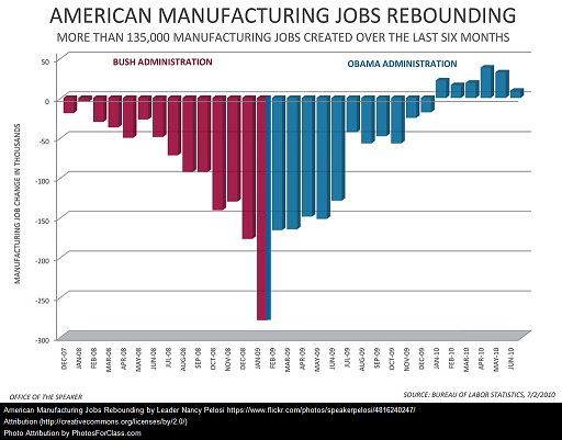
By looking at the graph to the left, we can see...
- The title indicates the graph is showing trends in manufacturing jobs in America
- The labels indicate the key points of the graph:
1. Jobs are being counted by the thousands
2. The years addressed cover President Bush and President Obama's administrations
3. The trends on the map seem to show job decline durung Bush's Presidency and job growth during Obama's Presidency
- Based on the data collected and interpretation of the key points, you can come to the conclusion that the graph is intending to gain support for Obama's policies because of the job growth they have created.
|
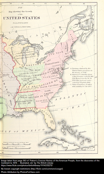
By looking at the map to the right, we can see...
- The title indicates the map is of territorial growth of the United State from 1783 to 1876
- The labels indicate the many boundary changes that occured during this time period:
1. The territory in pink represents the original 13 colonies
2. The territory in yellow represents lands formerly owned by other nations such as Spain
3. The territory in green represents formerly unclaimed territories such as the Mississippi Territory.
4. The red line indicates the original division separating British controlled east coast from the French Lousiana Territory. *Note: Louisana Purchase of 1803 brings this territory under British control
- Based on the data collecten and interpretation of the labels, you can come to the conclusion that the British controlled territory of North America grew greatly between the years of 1783 to 1876.
|
 |


Page 1 of 1 |


